
We are keen to receive review comments for our new paper which is now available for open peer review (pdf)
State of the UK Climate 2023
Paul Homewood
According to the Met Office, the UK climate “is continuing to change” and has become more extreme. But what does the actual evidence tell us? Using official data up to 2023, from the Met Office and other sources, this paper examines UK climate trends, and assesses the truth of these claims.
Submitted comments and contributions will be subject to a moderation process and will be published, provided they are substantive and not abusive.
Review comments should be emailed to: benny.peiser@thegwpf.org
The deadline for review comments is 19 August 2024.
Closed review comments on GWPF publications can be found here.
————-
Matt Sykes
“Previous Met Office studies indicated that much of the warming since the 1970s was the result of increased sunshine, likely due to cleaner air.”
Yes. This is met office data.
A 14% increase in sunlight since 1980, very likely due to the reduction in SO2 emissions from not burning coal. The irony that stopping pollution has caused temperature rise is I am sure not lost on you!
14% of the approx. 240 wm^-2 vastly out powers the 2 wm^-2 we have had from CO2, by a lot.
I know a farmer who had to start adding sulphur to his fields after the 1980s, turns out it is the fourth most important nutrient for plants.
————–
Dr. Richard Booth
This is a very interesting and informative document, but it is clear that Paul Homewood is not a statistician. Hence, among statements made about graphs, some appear to be self evident to any eye, so I would accept them without a statistical p-value, but others appear to depend on the eye of the beholder. I shall give examples in detailed comments.
Two general comments are that pages should be numbered, and the proper unit of temperature, ℃, should be used instead of C (which actually means Coulomb in SI). Yes, the BBC has lowered its standards and uses C, to the annoyance of at least one Met Office analyst I know of, but it doesn’t mean that a meteorologist like Homewood should.
Detailed comments (negative line number means counting up from the last) are:
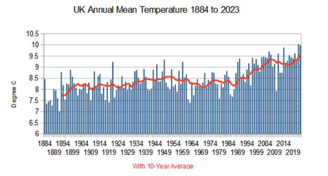
P2 L1: “rate of increase has slowed markedly since the rapid rise in the 1980s and 90s” – to me this is in the eye of the beholder, as the gradient of the red line seems as steep in the last 3 years as in the 80s and 90s.
P2 L-1: “it is not currently possible to separate the warming trend since the 1998 to 2007 period from the background of natural variability” – I disagree, because with random plusses and minuses in Figure 2, there should not be much discernible pattern. But the last 10 years are plusses, which may extend further in 2024, compared with 13 in a row for 1998-2009 and at most 5 in a row in the 70 years before that.
P3 L-1: “this is a weather phenomenon, not a climatic one” – if there were no statistical trend of warming over the last 30 years (for good or ill, a commonly used length of time known as “climatology”), this would be a reasonable statement. But there is. I happen to have an R program which gives trends for annual CET maxima (not means, admittedly, but those are unlikely to be very different), which for 1994 to 2023 gives a slope of 2.4℃ per century at a p-value of 5.3%.
P8 L-3: “daily extremes of temperature, as measured by the 5th and 95th percentiles have tended to decline since the 1970s” – this beholder does not see the red line in Figure 7 declining noticeably in that time period.
P10 L1: “the long term average is below the 1870s and 1920s” – the “long term” needs to be defined, because in Figure 9 (England & Wales) the 10-year average red line is not currently below the 1930 red point, so the statement appears incorrect for 10-year averages.
P11 L3: “principle” is a typo for “principal”.
P16 L3: For an average reader, explaining “isostasy” and glacial rebound would be useful.
————
Max Beran
The title is a bit of a misnomer. As the author correctly state in the paper, it’s about UK climate trends and what 2023 data adds to the story.
——————–
Peter Wilson
The steeper temperature rise in the UK from the mid 50’s to the late 80’s was likely due to the removal of so-called Solar Gloom created by the UK’s Clean Air Act: the removal of particulate carbon and sulphates in UK Coal Fired Power Station emissions. Later however, as determined by James Hansen, other countries such as India and China massively increased their industrial outputs powered by coal fired power plants, but with no emissions’ filters, and so increasing global particulate carbon and sulphates emissions! Hence the Pause.
———–
Professor Gwythin Prins
A very valuable paper. Two comments:
- We now know BRD that the Met Office (a) tampered/tampers with the CET record by modelling interventions of what the past temperatures ‘should’ have been – the cardinal sin – and (b) that the quality of its recording stations is steadily declining because of heat island effects for which it does not appear to correct. The paper plays a straight bat but alas the Met Office data is no longer peerless. Does this merit discussion by the author? Worth putting the question?
- Global events impact UK. The one discussed here is the Atlantic Oscillation. But in 2021-23 (as I wrote in Archimedes Fulcrum for NZW) we also had an extraordinary concatenation of low point solar plus El Nino plus the HTHH volcano (on which there are excellent satellite observation and analysis papers by Millan et al at JPL) which together produced ample non-human stressors to explain the global warming uptick and – maybe – increased precipitation due to stratospheric moisture increase. I haven’t yet seen any good papers proving that; but the hypothesis is well founded.
—————
Dr Graeme Mochrie
Thank you for this report, it made interesting reading.
The numbers speak for themselves, or do they? I have been following various blogs on climate for several years now and what you present seems to be in accordance with other data I have viewed. Since you are using Met Office data one has to assume that it is robust and reliable.
Everything you show is shown as an average, an average of an average, or possibly the average of an average, of an average of an average. It would be interesting if you had an appendix on how data was analyzed and from a statistical point of view, the validity of such homogenization. Climatology seems generally to rely on data sets that are derived from non uniform collection techniques e,g, thermometers placed at different heights from the surface, different rates of data collection from different sites (2-many), different thermometers…. Perhaps a critique of data collection and the limitations what can reliably be extrapolated would justify a future study. Certainly I have felt for a long time that no undergraduate would design experimental technique as poorly as meteorological data collection. Perhaps things are better now, but that leaves a huge record of historical data which must have greater variation and unreliability.
I like the use of the Central England data. Despite it’s limitations, it is a long enough to show your message of nothing much to see.
————
This is a very interesting and informative document, but it is clear that Paul Homewood is not a statistician. Hence, among statements made about graphs, some appear to be self evident to any eye, so I would accept them without a statistical p-value, but others appear to depend on the eye of the beholder. I shall give examples in detailed comments.
Two general comments are that pages should be numbered, and the proper unit of temperature, ℃, should be used instead of C (which actually means Coulomb in SI). Yes, the BBC has lowered its standards and uses C, to the annoyance of at least one Met Office analyst I know of, but it doesn’t mean that a meteorologist like Homewood should.
Detailed comments (negative line number means counting up from the last) are:
P2 L1: “rate of increase has slowed markedly since the rapid rise in the 1980s and 90s” – to me this is in the eye of the beholder, as the gradient of the red line seems as steep in the last 3 years as in the 80s and 90s.
P2 L-1: “it is not currently possible to separate the warming trend since the 1998 to 2007 period from the background of natural variability” – I disagree, because with random plusses and minuses in Figure 2, there should not be much discernible pattern. But the last 10 years are plusses, which may extend further in 2024, compared with 13 in a row for 1998-2009 and at most 5 in a row in the 70 years before that.
P3 L-1: “this is a weather phenomenon, not a climatic one” – if there were no statistical trend of warming over the last 30 years (for good or ill, a commonly used length of time known as “climatology”), this would be a reasonable statement. But there is. I happen to have an R program which gives trends for annual CET maxima (not means, admittedly, but those are unlikely to be very different), which for 1994 to 2023 gives a slope of 2.4℃ per century at a p-value of 5.3%.
P8 L-3: “daily extremes of temperature, as measured by the 5th and 95th percentiles have tended to decline since the 1970s” – this beholder does not see the red line in Figure 7 declining noticeably in that time period.
P10 L1: “the long term average is below the 1870s and 1920s” – the “long term” needs to be defined, because in Figure 9 (England & Wales) the 10-year average red line is not currently below the 1930 red point, so the statement appears incorrect for 10-year averages.
P11 L3: “principle” is a typo for “principal”.
P16 L3: For an average reader, explaining “isostasy” and glacial rebound would be useful.
———-
Reply by Paul Homewood
Hi Richard
Thanks for your comments, which I will try to take into account.
As far as specifics go;
P2 L1 : I don’t agree that 3 years is a meaningful period. Between 1981 and 2007, the 10-year average rose at a rate of 0.04C pa. Since 2007, the rate is 0.01C. Whether the last 3 years trend becomes the norm remains to be seen!
P2 L-1 : Fig 2 shows that annual temperatures can often fluctuate by 1C from year to year. Yes, we have had a run of warmer than average years recently, but can we be sure these are not just weather events? Remember I am not claiming they are, I am asking for proof that they are not.
P3 L-1: I think what I am saying is that the predominance of warmer days over colder ones is a meteorological phenomenon – whether we have a warm day or a cold day. The cause of this is a matter of conjecture of course. Under a warmer climate, we would expect the whole banding to move up (just as it would if we compared, say, London and Edinburgh temperature profiles.)
Looked at another way, 2023 was a warmer than average year because of the relative absence of cold weather.
P8 L-3: Figure 8, which charts the 5th and 95th perecentiles, suggests that daily extremes peaked in the 1970s and 80s – I ran the 10-year averages, though they’re not shown on the graph. The differences are not huge.
Fig 7 shows the difference between winter and summer means, not the daily extremes. As you say, the line is fairly flat since the 1970s, but has been falling over the longer timescales.
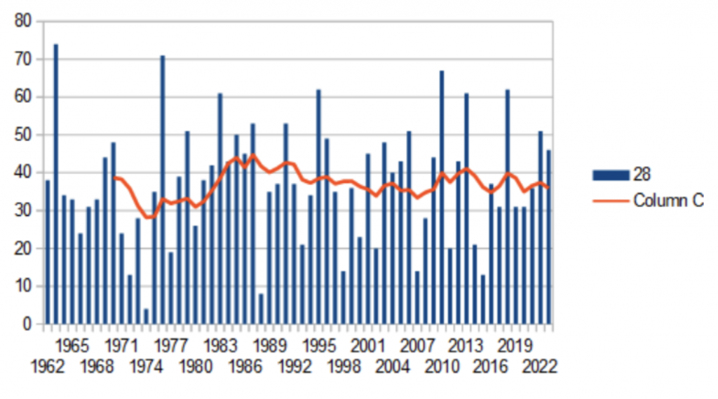
P10 L1: You are quite correct on this. I have amended the line to read:
“Annual rainfall in England & Wales has been increasing since 1980, but the 10-year average is at similar levels to earlier periods, such as the 1870s and 1920s.”
———–
Response by Richard Booth
Hi Paul,
Thanks for thinking about and responding to my comments. Below I have interspersed some #-denoted rejoinders for your consideration. I have conceded on some points but not on some others : – ). I hope the end result will be a paper with fewer hostages to climate alarmists…
As far as specifics go;
P2 L1 : I don’t agree that 3 years is a meaningful period. Between 1981 and 2007, the 10-year average rose at a rate of 0.04C pa. Since 2007, the rate is 0.01C. Whether the last 3 years trend becomes the norm remains to be seen!
# I’m afraid that climate alarmists will have a field day accusing you of cherry picking. The reason is that 1981 to 2007 is trough to peak, but 2007 to now is not. I wonder if it would be better to word it along the lines “following 25 years of warming from 1980, an unpredicted hiatus of about 10 years caused the overall warming rate since 1980 to be reduced from x pa to y pa”. By the way, I think Figure 1 could be made clearer. It would be normal to display a centred average rather than a trailing average, and for the date axis I would suggest 1980, 1990, 2000, etc. with larger ticks pointing to those years. At the moment, unless like you and I one knows that 2010 was the coldest year of this millennium, it is hard to match the x-axis dates to the graph lines.
P2 L-1 : Fig 2 shows that annual temperatures can often fluctuate by 1C from year to year. Yes, we have had a run of warmer than average years recently, but can we be sure these are not just weather events? Remember I am not claiming they are, I am asking for proof that they are not.
# OK, here is your proof. Your Figure 2 is quite an unusual way of presenting the data, but not illegitimate, and actually quite interesting. But if it was all just weather and no real warming, then each comparison of one year with the previous 30 should give a half chance that it is cooler (perhaps with some clumping due to short term climatic events like ENSO and TSI from the solar cycle). Let’s start at 1980 as above. There are 44 years from then to 2023, so about 22 should give negative points on the graph. But instead there are only 10 such years. How significant is that? The tail probability at 10 occurrences of the Binomial distribution on 44 possibilities and p=0.5 is 1 in 5000. QED, I’m afraid. I suggest removing this graph and accompanying text from the paper.
P3 L-1: I think what I am saying is that the predominance of warmer days over colder ones is a meteorological phenomenon – whether we have a warm day or a cold day. The cause of this is a matter of conjecture of course. Under a warmer climate, we would expect the whole banding to move up (just as it would if we compared, say, London and Edinburgh temperature profiles.)
Looked at another way, 2023 was a warmer than average year because of the relative absence of cold weather.
# Yes, I agree that under a warmer climate we expect the banding to move up. Do you have any evidence that it hasn’t? That is to say, does 2023’s graph look weirdly different from earlier individual years? Or, was it looking normal apart from pesky heat spikes which might be attributable to weather events?
P8 L-3: Figure 8, which charts the 5th and 95th perecentiles, suggests that daily extremes peaked in the 1970s and 80s – I ran the 10-year averages, though they’re not shown on the graph. The differences are not huge.
# OK, so you haven’t shown on the graph what you say, what you say is true but not by much, and to my mind almost certainly not true with any degree of statistical significance. Yet it would be extremely interesting if your work showed that the number of daily extremes was pretty unchanged at both the bottom and top end. However, I suspect that is not true. Would you mind sending Benny and me separate graphs for 5th and 95th percentiles? If, as I suspect, some cold extremes have been replaced by warm extremes, that is good news, because cold extremes kill more people than warm. (In climate newsletters that I send to friends, I always sign off with “global warming is both modest and benign”.)
Fig 7 shows the difference between winter and summer means, not the daily extremes. As you say, the line is fairly flat since the 1970s, but has been falling over the longer timescales.
# OK, I withdraw my comment on that, fair enough.
P10 L1: You are quite correct on this. I have amended the line to read:
“Annual rainfall in England & Wales has been increasing since 1980, but the 10-year average is at similar levels to earlier periods, such as the 1870s and 1920s.”
# Good.
—————
Thanks Richard
1) I’ve made the suggested text change about the 10-yr averages. Andrew Montford usually redesigns my graphs to make them look more professional So, I’ll pass your comments to him in due course.
2) I’ve deleted Fig 2 as well
3) The comment about warm days v cold days only concerned 2023. However there was a very similar pattern in 2022 as well.
One of the things I will try to do in next year’s review is to find a way to analyse this issue in greater depth
4) The paper states :
“And daily extremes of temperature, as measured by the 5th and 95th percentiles have tended to decline since the 1970s, with more warmer days offset by fewer cold ones. (Fig 8). The most extreme years were 1963, 1976, 1983, 1995, 2010 and 2018.”
The 10-yr averages show a slight fall:
I’ve attached two graphs, splitting the cold and hot days. You will see there has been a drastic reduction in cold days, less so for hot. Might be worth publishing these as well as the combined version?